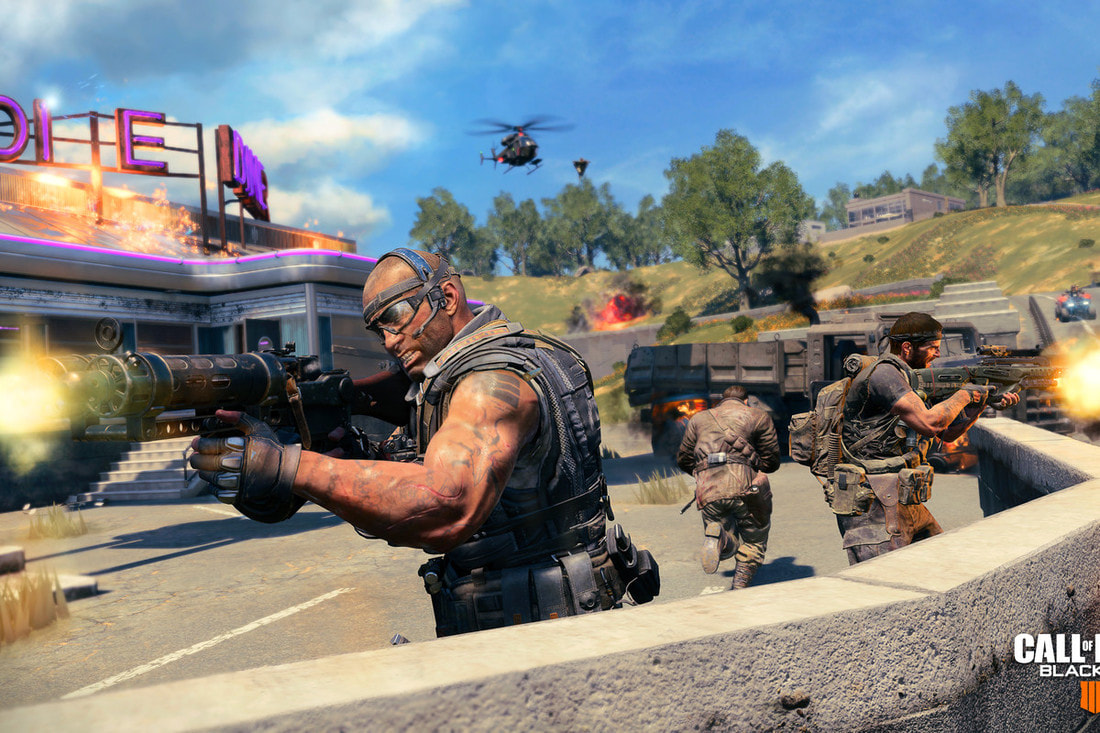
 “Call of Duty®.” Call of Duty®, www.callofduty.com/. Call of Duty black ops four has brought a new game mode called Blackout was released.This game uses a lot of principles and elements of design to convey the traditional Call Of Duty game. For elements the game uses Line as a format of shaping the map and guns, Lots of definitive texture for a realistic look. But the color palette is relatively small to depict real situation of our lives like grey, light brown, and green which gives a realistic look. Space is conveyed to show that certain cars or buildings are at a specific location and depends on your location to depict how large the object is, and the scale coincides with the space the object takes up. Some principles of design this game uses is proximity and contrast, with most battle royal games this is key and essential and is used a lot but gamer may not realize it. When a player doesn't look at his/her mini map but can see different parts of the map and analyze how far the distance is, they are using proximity. If a player notices a pixel unnaturally move or notices and unnatural object like another player that is the use of contrast. C.O.D used these elements and principles the most for the gaming experience. 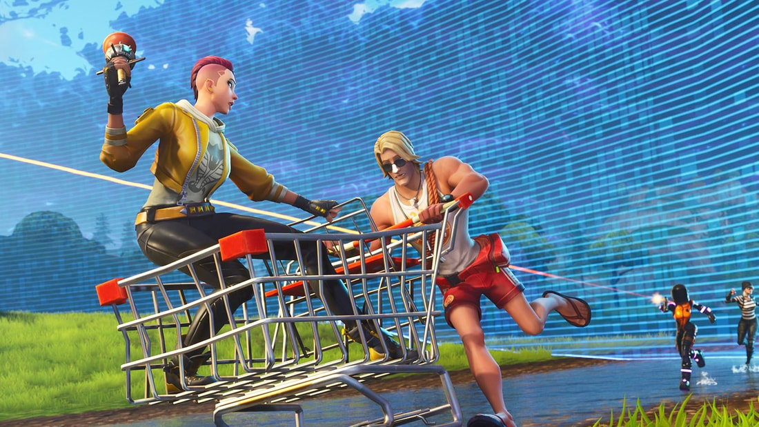 “Fortnite.” Epic Games' Fortnite, www.epicgames.com/fortnite/en-US/buy-now/battle-royale?sessionInvalidated=true. Fortnite has a different approach to these elements and principles. There is line use in every aspect of the game, Shape for every object , there is an array of colors interchanging from the skins to the map and cosmetic factors in the game. The texture is limited to mesh or Play-Doh style of texture. Unlike C.O.D the scale comparison from character to character is the same and all characters have the same relative hitbox. Fornite has the same principles as C.O.D but the game uses lots of repetition and emphasis, plus an over all rhythm.
0 Comments
In the DDA we have been working in Photoshop a lot, all of our projects this year have been dealing with Photoshop. We have been using specific tools to help us understand Photoshop. The first project I used Photoshop with was making a layered sandwich, were I have to make a BLT sandwich following the rules of duplicating overlaying, which is making a layer of a picture more transparent, to the required amount.Our second project was called workspace manipulation were I used the famous artist Andy Warhol's, technique and operation. We used a Threshold image of yourself (which is just a high contrast black and white image), and I needed to make a two by five grid of different color patterns and design to make my image stand out and be different. We used the magic want tool and the swatches panel to see the different number of color combinations. The most important aspect of this project is using the eraser to to ad your color if you followed directions. The most recent project involving pure Photshop is the colorizing using blend modes assignment, were I would take a grayscale image and add color using magic wand or quick select tool methods, Then I would add overlay to the colored part of the image to portray realistic color and pigment either in clothing, skin of animal, object, or human. Just like ww1 in color this is the same technique by adding realistic color and realistic look on top of a non colored subject. In conclusion, DDA uses the same tools with Photoshop but could have very different purposes to convey different objectives. SummaryAll of our classwork has been heavily based on Photoshop this quarter.
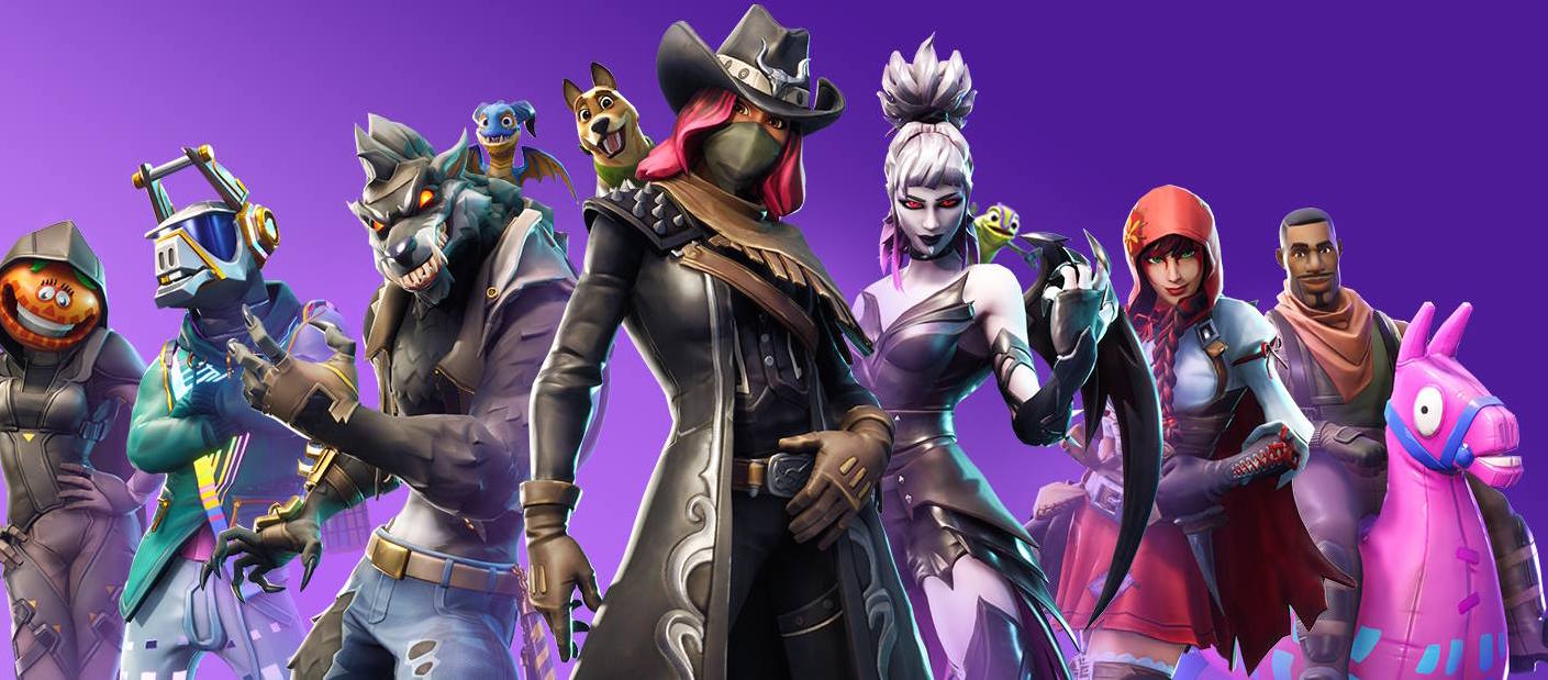 “Fortnite.” Epic Games' Fortnite, www.epicgames.com/fortnite/en-US/buy-now/battle-royale?sessionInvalidated=true. Beginning at July 12, 2018 and ending in September season five in my opinion had the largest impact on the community and players of Fortnite. The new additions of cosmetics, graphics, skins, and map editions helped boost the games gross rate as of March this year it has been recorded Fortnite has been making 200 million each moth off of its consumers. Season five added large amounts of weapons and mini games, such as golf and a golf course called Lazy Links, Basketballs were you could shoot the ball into any net at any time in the game, and finally a beach ball that could be used also at leisure but didn't have any interaction with the map. Another important feature is bringing the introduction of Rifts, Grapplers and A.T.K's each of these items are a form of transportation to a location, A.T.K is a fancy way of saying go kart, Rifts are like a ripple in time and give you the powers to fly in from the same spawn height, but at the location were you used it. Grapplers are grappling hooks but have plungers on the end instead of a conventional hook. The adding of these item coincided with the introduction of new weapons like the compact and standard Smg, Heavy sniper, and Tommy gun which would end up eventually be take out of the game for being "over powered" and to good. The final sum up is the connection between the new map locations like, Paradise palms, Lazy links and another updated dusty divot. But with the recent season there is a theme and occurring transformation from one season to another and it was the Cube. This was an object that was clearly alien and caused a positive uproar in the community and controversy on what it is. In conclusion fortnight made good decisions in progressing the game industry and community SummarySeason 5 had lots of hype and exceeded the high expectations.
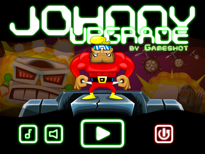 "Johnny Upgrade." Johnny Upgrade - Play It Now at Coolmath-Games.com. Accessed October 16, 2018. https://www.coolmathgames.com/0-johnny-upgrade. This image is of a online game (on Coolmathgames.com) that I play. This game has basic color schemes like how the use of a bright green and red is represented or dark blue/violate is used with orange as the background effect. The color palette maintains mostly contains complementary colors and split complimentary colors the game brings a exiting friendly atmosphere, with an honest and energetic feeling. These colors connect with the intentions of the character. Because the main character needs to fight and beat monsters that destroy land and life, also a reason for the color model is for marketing and select audience because the audience is toward children or video game players. Bright energizing colors are not mature and are usually used in games or kid shows. A very important aspect of video games is the message and mood that coincides with audience perceptions, like how kids are attracted to bright colors but some adults don't perceive those colors as attractive, as a teenager the mood is energetic and represents a superheros colors and themes. Without the direct picture and man with huge muscles the colors convey a hero or powerful person or object. Most of the enemies are dark and convey mature or evil setting. In the game robots are the enemies and are silver or gray and black to represent danger or presence of evil. All of the rays and blast from the enemies are orange and fire-like or dark or beam racing towards you. All friendly or hero-like beams of power are white or green. SummaryWithout the correct color pallet there s no meaning mood n in your picture or game.
Most if not all good picture or games use color harmony |
AuthorHello, I am Jacob Creator of the very not boring, interesting page. The views and opinions expressed in this blog are solely those of the author and do not represent those of Durham School of the Arts or Durham Public Schools. Archives
May 2022
Categories
All
|
 RSS Feed
